Frequently Asked Questions

What are your art specifications for folded pieces?

Ai has the capability to do several types of folds. Please follow this link to download a PDF of our Ai Folded Product Sheet.

What is your preferred method to receive art files?

The fastest way to send Ai files is to upload them to our ftp site. You can do this easily by clicking the File Upload button in the footer at the bottom of the page under “Client Services” and follow the instructions. You can also email the files to your Customer Service Representative.

What file types do you accept?

Our desired file format is a press-quality PDF with crop marks and bleeds. However, we will accept the following extensions: .jpg, .jpeg, .gif, .bmp, .png, .tiff, .pdf, .eps, .psd, .ai, .indd, .pub, .qxd, .ppt, .pptx.

Does Ai have in-house fulfillment?

Yes. Ai offers one-stop service for design, print, lettershop, mailing, emailing, and fulfillment.

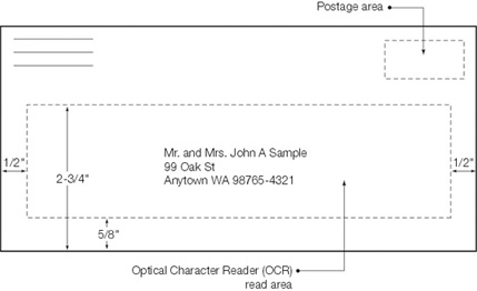
What are the dimensions of a letter size mail piece?

Letter-size mail size is:

  • Not less than 5 inches long, 3-1/2 inches high, and 0.007-inch thick.
  • Not more than 11-1/2 inches long, or more than 6-1/8 inches high, or more than 1/4-inch thick.
  • Not more than 3.5 ounces (First-Class Mail letter-size pieces over 3.5 ounces pay flat-size prices).
  • Rectangular, with four square corners and parallel opposite sides. Letter-size, card-type mailpieces made of cardstock may have finished corners that do not exceed a radius of 0.125 inch (1/8 inch).

What are the address placement boundaries on a letter-size piece?

  • Left: 1/2 inch from the left edge of the piece.
  • Right: 1/2 inch from the right edge of the piece.
  • Top: 2-3/4 inches from the bottom edge of the piece.
  • Bottom: 5/8 inch from the bottom edge of the piece.
  • Download a visual guide for these boundaries.

How do I export a .pdf correctly?

How should I attach Fonts?

All fonts MUST BE embedded! Also, we prefer no subsets.

How do I get a grayscale image in a CMYK document?

Gray scale images that are converted to CMYK will have a color shift in the final print. That shift may be green or yellow. Always check the CMYK values of your grayscale in the final CMYK document. If there are other values other than K in your grayscale image, there is a chance that the color will vary. To eliminate all values other than K, use your Channel Mixer (adjustment layer) in Photoshop, then click “Monochrome” and adjust accordingly.

How can I make sure my blues do not come out purple?

When using a blue in your design, always make sure to leave at least a 30% difference in your Cyan and Magenta values. Blue is close to purple in the CMYK spectrum. Remember, use a low amount of magenta whenever using high amounts of cyan to avoid purple. Example: C-100 M-70 Y-0 K-0.

Setting Bleeds

If any image or art extends right to the edge of any page, it needs to bleed off the page. Our standard is 1/8”, sometimes more on saddle-stitched books with 32 pages or more and/or copy close to the trim.

Crop Marks

Each page should be saved with crop marks. They should be at the trim size of the page, and offset from the page at least 1/8” (if bleed is greater than 1/8”, then offset marks at least as much as the bleed). Images – Postscript or PDF files should include all image data. High Resolution, No OPI. We prefer CMYK images with no profiles embedded. Even though our workflow provides color conversion, there will always be variations when converting, due to the limits of the CMYK color gamut.

Image Resolution and Size

We recommend that your images have at least 300 dpi effective resolution (that’s after any scaling). Industry recommends a dpi of twice the final line screen that a job will be printed, so 350 dpi or 400 dpi is even better. Be very careful of JPEG and other forms of compression. Although they can decrease the overall size of your file, they can also affect the quality of the image. It’s a good idea to check your images closely after compressing them (saving as jpg, included). Look for artifacts, pixelization, graininess, blurring, extreme color shifts, etc.

Common Image and Color Issues

Solid Blacks- Large Black areas need to have color underneath them to give it good density. Our standard for these “Rich” Blacks is 40% Cyan, 30% Magenta, 30% Yellow, and 100% Black. A common mistake is to use 100% of all colors, which can cause problems on press.

Banding

We’ve all seen it; sharp breaks in color where a smooth transition is desired. There are MANY reasons for banding, and almost as many workarounds that people have come up with. Though there is not one specific cure-all, here is some advice: Banding often occurs when ‘stretching’ a short tonal gradation (5%-to-0%, for example) over a large distance. Images created in Photoshop tend to be softer on the banding, and Photoshop also has the best tools for avoiding or masking the banding. If possible, keep the gradation as a separate image and lower the dpi setting, thereby decreasing the ‘detail’ and creating less emphasis on the breaks in tone. Finally, check the internet. There are lots of forums and helpful sites that offer more solutions.

Single Pages vs. Spreads

MOST of the time, single pages are preferred. If job binds any other way than saddle stitch, then it’s also better NOT to use facing pages, because we need bleed, then, on all four edges of the page.

Layout

It is always best to lay out a job to the size it will be produced, as opposed to placing it into a larger document. Objects that cross-over from one page to the next should line up. Keep pages oriented the way they will print. And, on any job that folds, the panel sizes need to be set so that the job will fold flat. Often times one or more panels need to be short to allow it to fold. (Please see our Folding Guide, or call us for consultation.)

Also be aware of margins and copy too close to trims or folds/binding. If you have borders, the thinner they are, the more likely you will notice any slight variations once it is trimmed. The same goes for copy, like folios that are very close to the trims. And the more pages in a book, it becomes even more apparent. We have adjustments to compensate for such things, but there are always variances. For example, if our cutter is 1/64” off on a 1/4” margin, you likely won’t notice. But the same 1/64” on a 1/16” margin will stand out.

Transparency Tips

Transparency is a feature that is being used more and more by designers to enhance the attractiveness of their design. It also brings with it a complexity that adds to the challenge of reproducing the designer’s artwork. New technology has made great progress in how the transparency is dealt with, and the future looks to be even brighter. But there are still going to be files that give us trouble, especially as designers get more and more creative all the time. The good news is there are some precautions that can be taken to reduce the risk that problems will arise.

Install and use the latest software updates.

Move all objects that don’t interact with transparency to the top layer of the document (On a separate layer, above the transparent items. Transparency will affect all that is below it). Text is a good example here. Any characters that are overlapped by a shadow, or other transparent object, will be rasterized and appear ‘fatter’ than the rest of the copy.

Be careful when you mix spot colors with transparency. Spot colors may display colors on process plates or convert to process. Some prepress software may inadvertently misinterpret flattened EPS files, which results in converting spot colors to process. In this case, do not use EPS; export PDFs from native files WITHOUT flattening OR convert spot colors to 4-Color Process and export either flattened or with native transparency intact (PDF).

Be aware of your Flattener Presets and your Transparency Blend Space, as they will definitely affect your output. If your images are CMYK (Ai preference) and your Transparency Blend Space is RGB, or vice versa, your color will be affected when processed. We suggest saving your images as CMYK and setting your Transparency Blend Space to CMYK as well. We have included on this site our custom settings for Flattener Presets, which we have found to solve MOST issues when saving flattened files.

Be careful when adding color to a picture box to colorize the image or its background; it is preferable that the assigned picture fill the entire box. Even without transparency, this can sometimes cause the background to print differently where the picture is from where it doesn’t fill the picture box. If there is some form of transparency applied, then there most certainly will be a tonal difference there.

Take a look at your file in Overprint Preview Mode for the best representation of how it will print. This should show you how the transparencies interact with the other objects on the page.

Exceptions for our Digital Workflow – Due to the nature of our Digital Workflow, there are some exceptions that require different specs than our conventional workflow.

Solid Blacks – Due to the digital presses using toners instead of ink, and the order in which the toners go onto the stock, large solid black areas should be BLACK ONLY.

Transparency – We prefer that files supplied for digital printing be flattened. Please read our Transparency Tips to help ensure your best results.

It is always best to know how your job will print before you prepare/save your files. We understand that is not always the case. If you are ever unsure of how to prepare or save your files we will gladly assist you. You can also send us the native application files and let us print them as we need to print them.

Can’t find the answer you are looking for?

Ask your question here.